
Summary
Triple Korea sets the gold standard for integrated trip planning, keeping users in-app through built-in navigation and native reservation management.

Building a Zero to One Local-First Discovery & Booking Ecosystem for a Startup
00 · OVERVIEW
Locals don’t plan travel in one straight line —
but today’s tools behave like they do.
Trippy is a Hong Kong-based startup building an AI travel platform designed to bridge the gap between “tourist-trap” planning and authentic local discovery.
As the sole lead UX designer, I led the product from a blank canvas to a high-fidelity beta, transforming a fragmented planning process into a consolidated experience for Hong Kong locals and travelers.
01 · Problem
Travel planning today is a “Frankenstein” workflow. Users juggle Instagram for inspiration, Google Maps for navigation, and spreadsheets for scheduling.
For Hong Kong locals, this is particularly frustrating because existing platforms fail to surface:
Planning a trip means starting from scratch — jumping between tools, filtering endlessly, and assembling everything yourself.
Recommendations are often generic and tourist-heavy. They lack “vibe-based” discovery (e.g., “Where is a good date spot near me now?”).
Rigid 5-day itineraries don’t match the need for short, spontaneous weekend outings.
02 · Research
Before diving into the design phase, we began by breaking down the problem into key pain points. We then selected and evaluated popular travel planning and booking apps to understand how they addressed these issues.
Summary
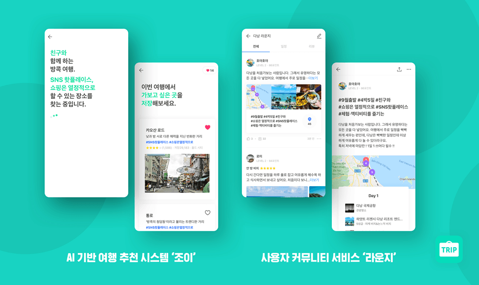
Triple Korea sets the gold standard for integrated trip planning, keeping users in-app through built-in navigation and native reservation management.

Summary
Real-time, Google Docs-style collaboration for group planning, but external booking redirects often disrupt the mobile experience.

Summary
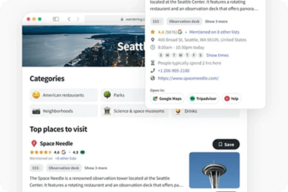
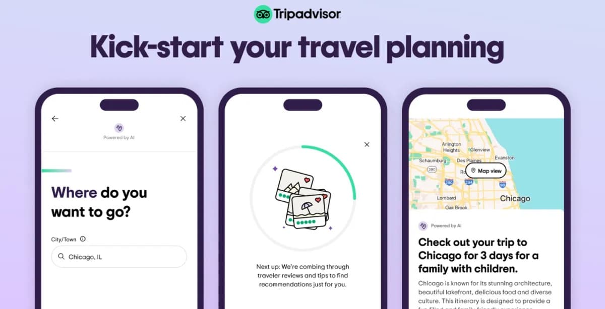
Trip.com, Klook, Tripadvisor, and Agoda suffer from cluttered, unfocused experiences. Agoda buries AI summaries in dense UI, while Tripadvisor hides booking within heavy content flows.
*Only key insights are shown for simplicity.
Strategic read
Across competitors, the same pattern kept surfacing: generic planning flows, booking-first discovery, and untapped expert trust — leaving room to pair curated local guidance with a real itinerary workflow.
Discovery Lacks Meaningful Context
Planning tools and booking platforms optimize for ease and volume, not relevance.
Users are left sorting through generic recommendations and overwhelming options to find what actually fits their vibe.
Wanderlog · Trip.com · Klook · Tripadvisor
Experts Exist, Just Not for Travel Planning
People already trust vetted local experts in other marketplaces.
That model hasn’t been applied to travel discovery yet.
Soomgo
Pair expert-led local picks with planning workflow to raise discovery quality without the tourist-default noise.
03 · Strategy
To evaluate this hypothesis, we explored how a consultant-led model could be operationalized through early research, stakeholder conversations, and feasibility analysis, which revealed key structural challenges.
FROM — EXPERT MARKETPLACE
TO — COMMUNITY CROWDSOURCING
High onboarding friction
Verification processes, resume requirements — too much friction for consultants to join.
Low friction
Anyone can contribute instantly — “Is it raining in Sai Kung now?” gets answered in real time.
Marketplace complexity
Two-sided marketplace payment infrastructure would delay MVP by months.
Technical debt (acceptable tradeoff)
Achieves the same authenticity goal through community trust, not payment processing.
Slow to ship
Complex overhead prevented us from validating core assumptions.
Fast to validate
No marketplace dependencies means we can test real user demand and behavior immediately.
04 · Validation
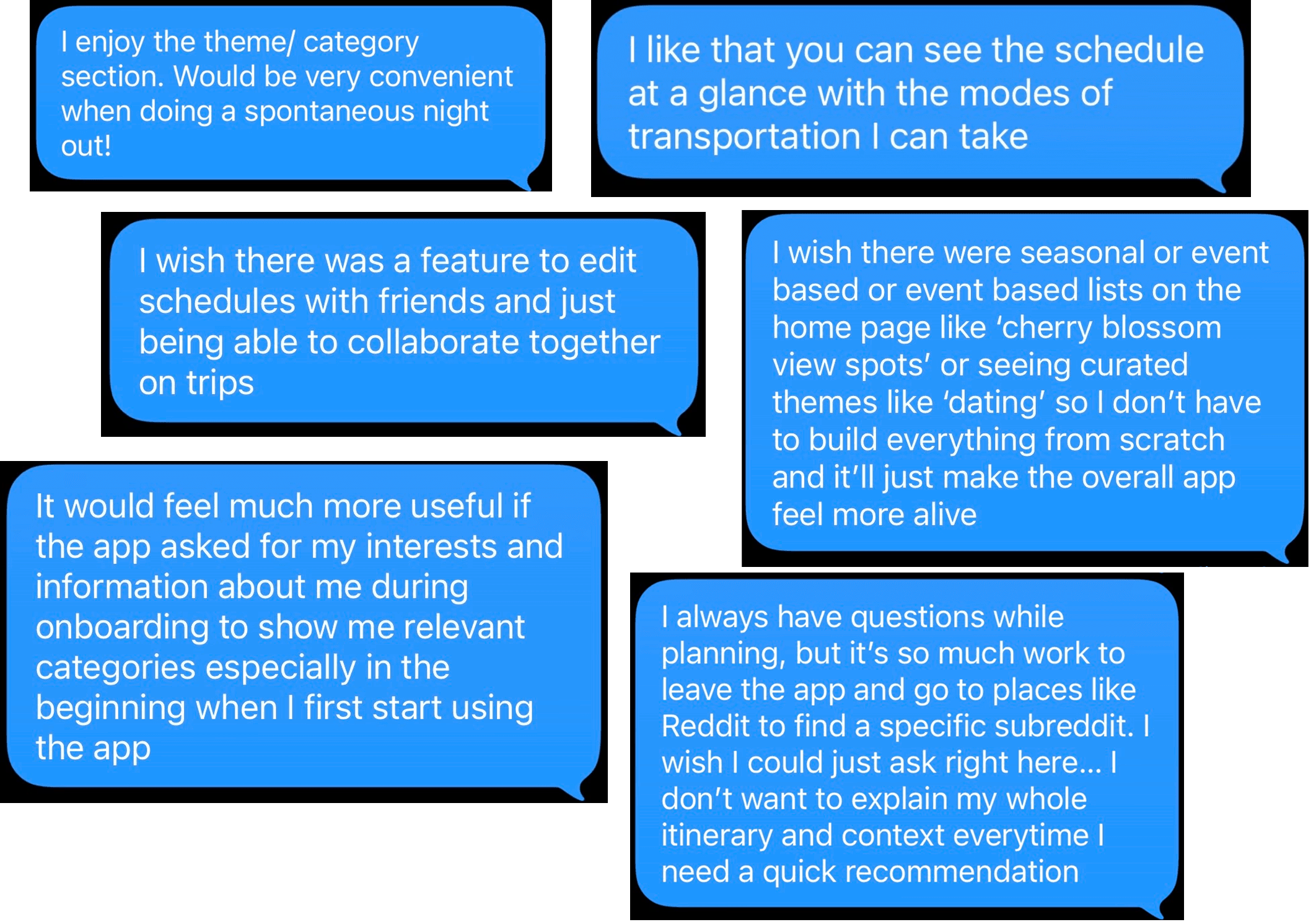
New insights: users plan in two modes, lose momentum across tools, and struggle with overload
We translated these insights and initial research into early concepts. We focused on reducing planning effort through AI-generated itineraries and community-driven discovery, then validated this direction and uncovered additional user needs through testing with 200+ users.
200+
Active participants joined the beta launch
50
In-depth interviews were conducted to identify UX friction
52.8%
Day 1 retention rate recorded during the testing period
Synthesis
These patterns pointed toward a product that could flex between fast, vibe-first decisions and deeper planning — without forcing users to rebuild context every time they switched tools.
05 · Solution
The all-in-one travel companion
Trippy streamlines the entire travel lifecycle by consolidating discovery, community, and booking into one seamless journey. By treating every part of your trip like a modular “playlist,” we replace fragmented app-hopping with a single, intuitive platform.
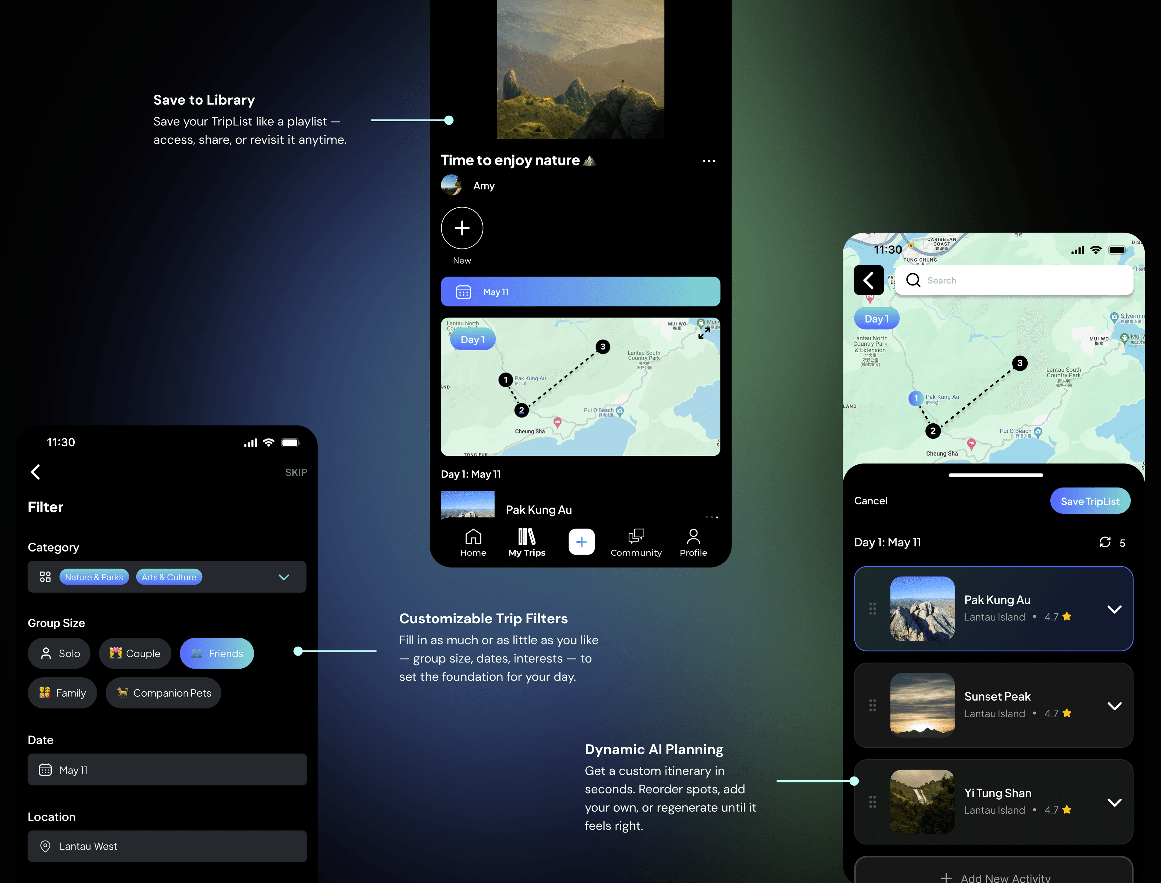
Generate and refine trips without building everything from scratch.
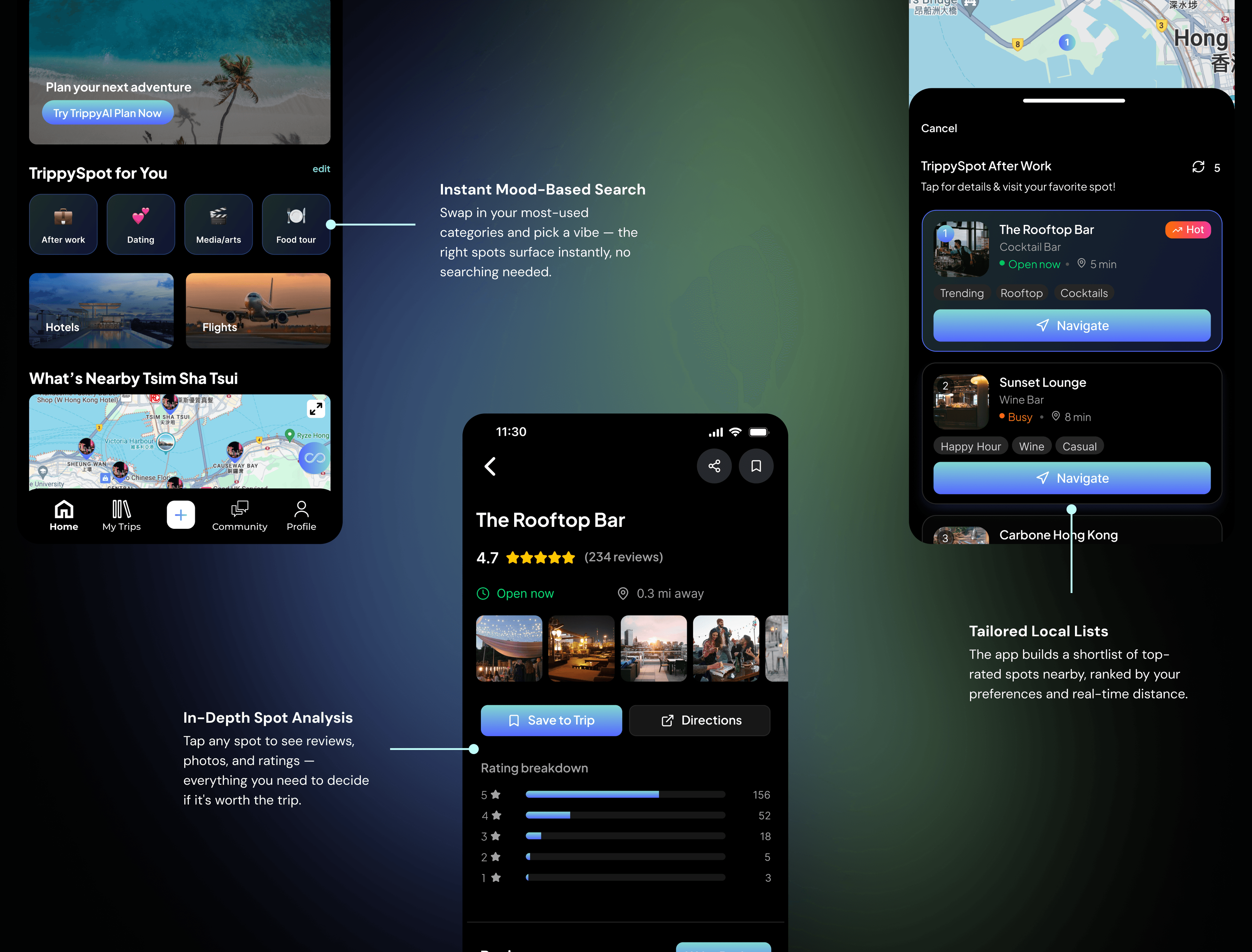
Surface new, relevant spots instantly by combining preferences, selected vibes, and community-driven insights.
Bring discovery, community, and planning into one seamless flow — reducing the need to switch tools and manually piece trips together.
Enables quick, vibe-based decisions for spontaneous plans — surfacing relevant spots instantly without requiring full trip planning.
Turn preferences into a ready-to-use itinerary — eliminating the need to plan from scratch. Generate, refine, and customize trips in seconds while maintaining full control.
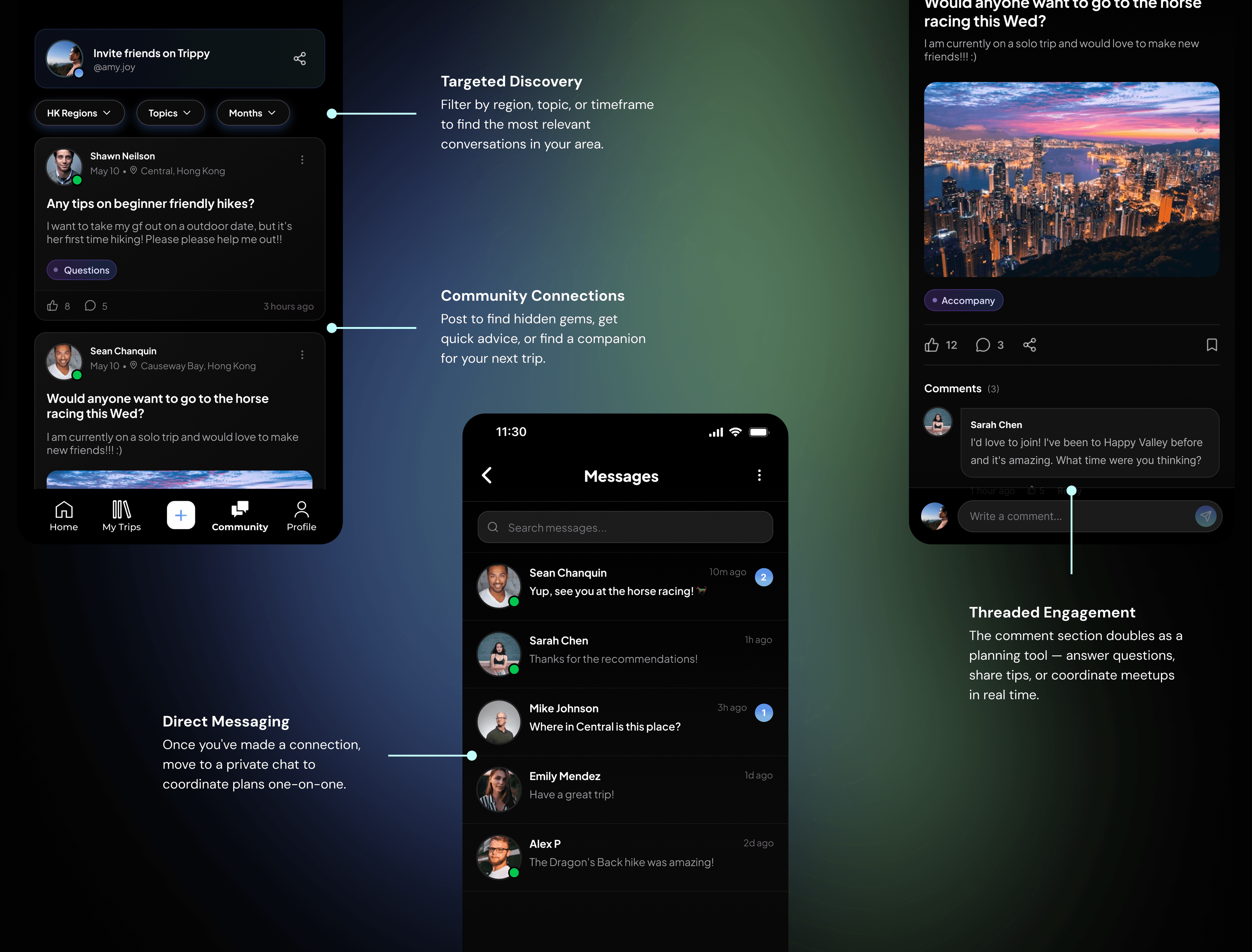
Get real-time, context-specific insights from locals — ask questions, explore discussions, and find relevant recommendations without leaving your planning flow.
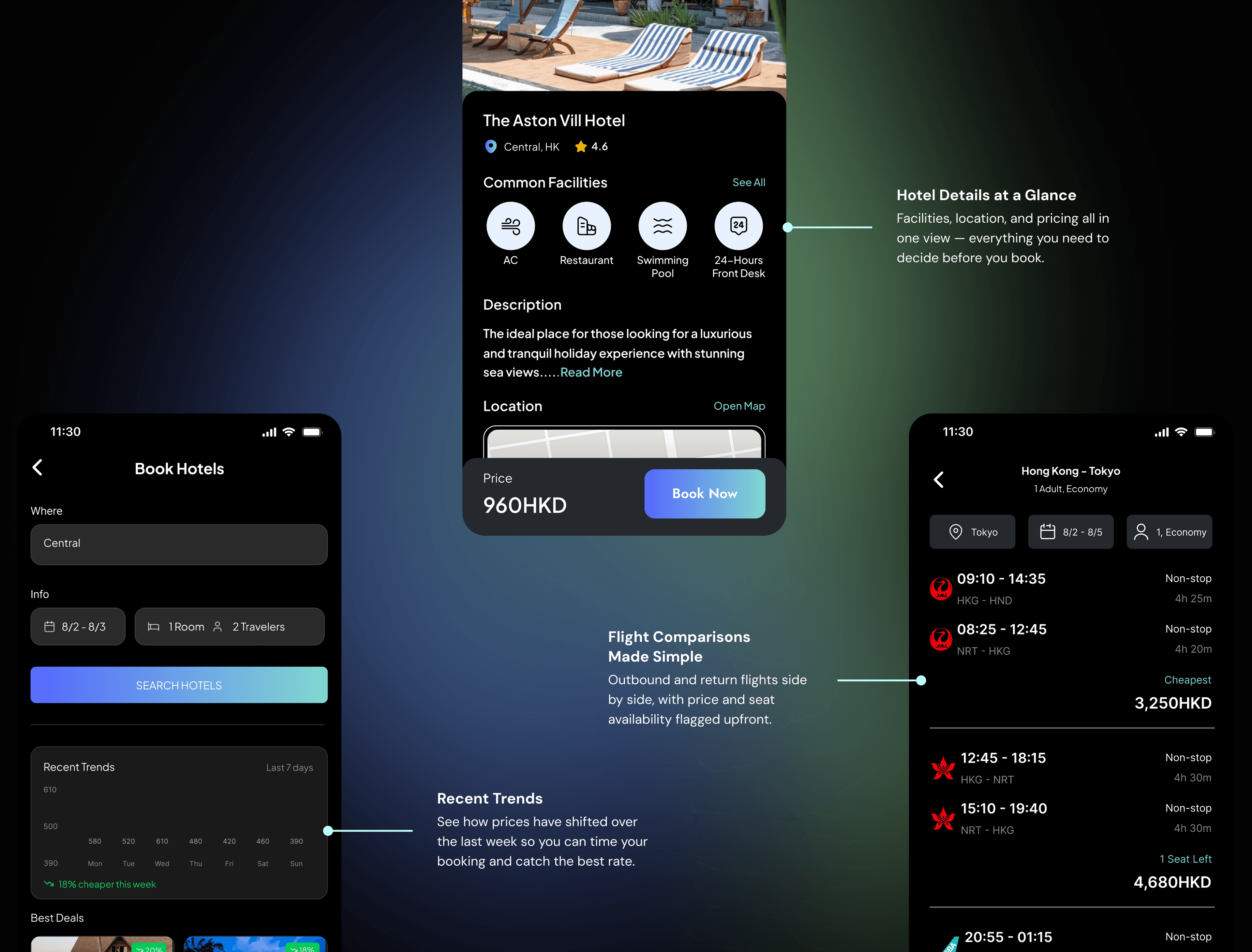
Compare prices, check availability, and lock in both flights and hotels in one place — no switching between apps or losing your place in the plan.
06 · Decisions
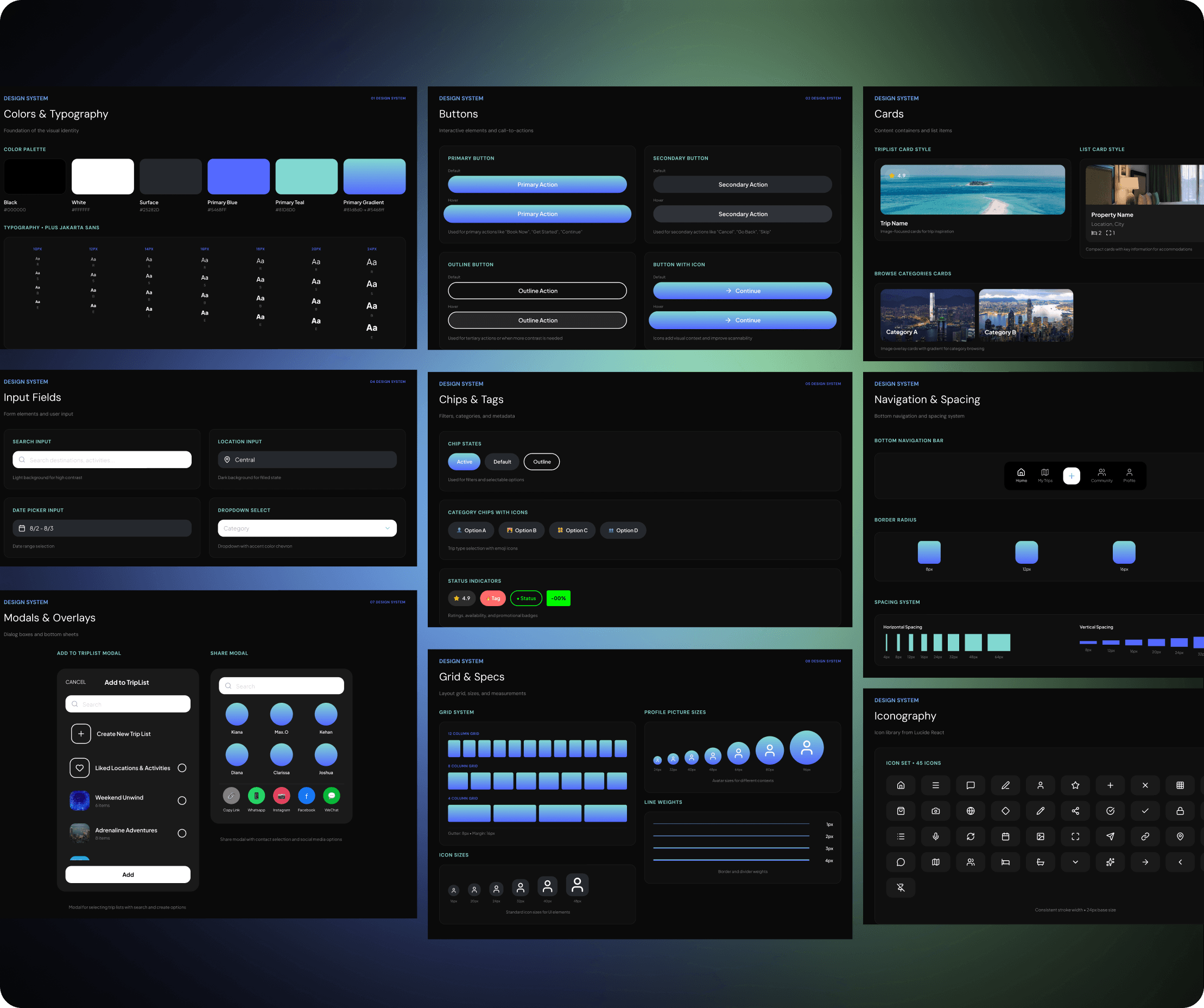
The design system for Trippy is a comprehensive toolkit that ensures consistency and efficiency across all user interfaces. It includes a set of reusable components, style guidelines, and design patterns that maintain a cohesive look and feel throughout the app.
07 · Reflection
Building Trippy taught me that great travel experiences aren’t about adding more features — they’re about removing the noise. I translated the high-anxiety chaos of planning into a modular “playlist” system that feels as intuitive as listening to music.
Beyond the interface, this project shaped how I think about product design holistically — balancing business goals, technical feasibility, and user experience while designing systems that scale.
Great experiences come from reducing complexity, not adding features. Distilling planning into a lightweight, modular system made the product feel intuitive and approachable from the first interaction.
Working across leadership and engineering meant constantly aligning needs with constraints — but never at the cost of simplicity. If a complex task can't be reduced to a single, effortless action, the design isn't finished.
The goal wasn’t automation for its own sake, but preserving user agency. AI handled the heavy lifting, while users remained in control — shaping their own trips rather than being led by the system.
More case studies

